
The Icon block is available in the PublishPress Blocks plugin. This block allows you to add icons to WordPress content. This block uses Google’s Material Design icons. You can customize the style, size, color, link, margin, padding, background, border and more.
How to create the PublishPress Icon block #
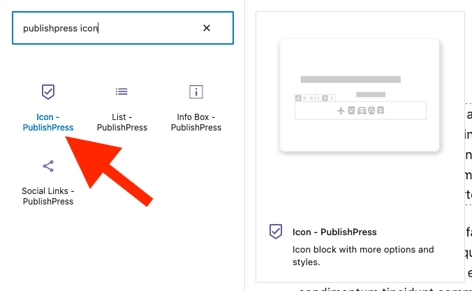
You can create an Icon block by clicking the “Icon – PublishPress” button in the PublishPress Blocks category:
Settings for the PublishPress Icon block #
You can adjust key settings for the icons by using the right sidebar. The first option allows you to decide the number of icons in the row:

Choose Your Icon #
The key setting for this block is choosing your icon.
- Click the “Icon Selection” button.
- You can now browse for icons, or use the “Search icons” feature.
- Select an icon and click “Apply” to add icon to your post.
In addition to choosing an icon, you can select a “Style” from this dropdown:
- Filled
- Outlined
- Rounded
- Two-Tone
- Sharp
After choosing your icon, you can also choose “Default” or “Stacked” in the sidebar. “Stacked” will add a border to the icon.

Key settings for the PublishPress Icon blocks #
After you choose an icon, you will see extra settings in the right sidebar:
- Icon Size (in pixels)
- Icon Color
- Icon Background
These border options will only appear if you choose “Stacked”:
- Border
- Border Size
- Border Radius
The “Link” area allows you to add links to your icon. Add the icon to the box labelled “Paste URL or type to search”.
In the “Padding” and “Margin” areas you can choose the padding and margin for your icons, using px, em or vh.

Default settings for all your PublishPress Icon blocks #
You can set default options for every PublishPress Icon block added to your site. This is possible with the PublishPress Blocks default configuration feature and it allows you to create a consistent look-and-feel for all your icons.
- Go to “Blocks” in your WordPress admin menu, then “PublishPress Blocks”.
- Click the “Icon” settings icon.

- Adjust the default settings and save.
