
The Checkout block displays a PublishPress Cart checkout form inside the WordPress block editor.
Use this block when you want to place a product checkout form on a page, post, or product layout without using a shortcode. The block can select a product, choose a payment plan, apply a coupon code, reorder checkout sections, change checkout text, and adjust the form design.
What is the Checkout block? #
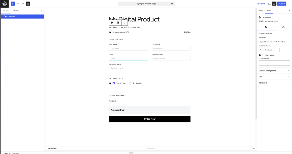
The Checkout block is the block editor version of the PublishPress Cart checkout form.
When the Checkout block is selected, the right sidebar shows the block settings. These settings control the product, content order, text labels, and design for this specific checkout block.
Product Settings #
The Product Settings panel controls which product the checkout form sells and how the checkout starts.
- Product: Choose the product for this checkout form. Choose Dynamic product to use the current product when the block is placed inside a product context.
- Payment plan: Choose which payment plan should be selected by default. Choose Product default to use the product’s normal default payment plan. This option appears when the selected product has available payment plans.
- Hide Labels: Hide labels above checkout fields. Customers will still see field placeholders where available.
- Coupon Code: Enter a coupon code to apply automatically when the checkout form loads. This is useful for landing pages or special campaign pages where the discount should already be applied.
Changing the Product resets the selected payment plan because each product can have different payment plans.
Content Arrangement #
The Content Arrangement panel controls the order of the main checkout sections.
You can drag sections up or down, or use the arrow buttons on each section. Click Reset arrangement to return to the default order.
The default section order is:
- Payment Plan
- Coupon
- Contact Info
- Payment Method
- Payment Details
- Order Bumps
- Order Summary
- Terms & Consent
- Express Payment
- Submit Button
Payment Plan #
The Payment Plan section shows the product’s payment options.
This section is available when the product has more than one visible payment plan and the product settings do not hide the payment plan area.
Use this section to move the payment plan choices above or below other checkout sections.
Coupon #
The Coupon section shows the coupon code field and coupon status message.
This section is available when coupons are enabled for the product. If the product does not show a coupon field, the section is marked Unavailable in the arrangement list.
Contact Info #
The Contact Info section shows the customer fields, such as first name, last name, email, phone number, company name, custom fields, and address fields when those fields are enabled for the product.
This section is always available because checkout needs customer information.
Payment Method #
The Payment Method section shows the available payment methods, such as credit card or cash on delivery.
This section is available when at least one payment method is enabled globally and allowed for the selected product.
Payment Details #
The Payment Details section shows the payment fields for the selected gateway. For example, with Stripe, this section contains the credit or debit card field.
This section is available when the payment gateway provides payment details fields.
Order Bumps #
The Order Bumps section shows additional offers on the checkout form.
This section is available when order bumps are configured for the selected product. If no order bump is configured, the section is marked Unavailable.
Order Summary #
The Order Summary section shows the order total. It can also show subtotal, tax, discount, custom quantity fields, and order bump items when those details apply.
This section is always available for normal checkout forms.
Terms & Consent #
The Terms & Consent section shows terms and conditions, privacy policy, and opt-in consent checkboxes.
This section is available when the selected product has a terms URL, privacy URL, or opt-in consent checkbox configured.
Express Payment #
The Express Payment section shows express payment buttons, such as Stripe express payment options.
This section is available when Stripe express payments are enabled and available for the checkout form.
Submit Button #
The Submit Button section shows the final checkout button, such as Order Now.
This section is always available because customers need a button to submit the checkout form.
Arrangement for 2-Step forms #
When the form skin is 2-Step, the arrangement panel separates the checkout into steps.
- Step 1 contains Contact Info and is locked in place.
- Step 2 contains the remaining checkout sections and can be reordered.
This keeps the first step focused on customer information while still letting you customize the order of payment, summary, consent, and submit sections.
Unavailable sections #
Some sections may show an Unavailable label. This means the section is supported by the Checkout block, but it is not active for the selected product or current site settings.
Examples:
- Coupon is unavailable if the product does not show the coupon field.
- Order Bumps is unavailable if the product does not have order bumps.
- Terms & Consent is unavailable if no terms, privacy, or opt-in checkbox is configured.
- Express Payment is unavailable if express payments are not enabled.
Unavailable sections can still appear in the arrangement list so the saved order remains consistent if the feature is enabled later.
Text #
The Text panel lets you override checkout headings and labels for this block.
Leave a field empty to use the product or plugin default text. Click Reset text to remove all text overrides for the block.
Section headings #
These settings are available for the main checkout form:
- Contact info heading: Change the heading above the customer information fields. The default is Contact Info.
- Payment plan heading: Change the heading above the payment plan choices. The default is Payment Plan.
- Payment info heading: Change the heading above payment method and payment details sections. The default is Payment Info. This setting is not shown for opt-in forms.
- Order total heading: Change the heading used when the checkout shows a simple total. The default is Order Total.
- Order summary heading: Change the heading used when the checkout shows a detailed summary. The default is Order Summary.
- Due today label: Change the label used for recurring or multi-payment totals. The default is Due Today.
- Amount due label: Change the label used for a standard amount due. The default is Amount Due.
Step tabs #
These settings appear when the form skin is 2-Step:
- Step 1 heading: Change the first step heading. The default is Get it Now.
- Step 1 subheading: Change the first step subheading. The default is Your Info.
- Step 2 heading: Change the second step heading. The default is Payment.
- Step 2 subheading: Change the second step subheading. The default is of your order.
Split-in text #
These settings appear when the form skin is Split-in:
- Site heading: Change the site heading shown in the split layout. The default is the site title.
- Form heading: Change the heading above the checkout form. The default is Get ready to start selling.
Design #
The Design panel appears in the block editor Styles tab. These settings adjust the visual style of this Checkout block.
Click Reset design to remove the design overrides and return to the product or plugin defaults.
Form skin #
The Form skin setting controls the checkout layout.
- Product default: Use the form skin configured in the product settings.
- Normal: Show the standard checkout form.
- 2-Step: Split the checkout into two steps.
- Opt-in: Show an opt-in style checkout form for lead capture or free opt-in flows.
- Split-in: Show a split layout with product or site information on one side and the checkout form on the other side.
Style preset #
The Style preset setting applies a predefined design style.
- Product default: Use the product or plugin default styling.
- Minimal: Use a more compact, square style.
- Carded: Place the form in a card-style surface with rounded corners.
- Compact: Use a boxed, tighter layout.
- High contrast: Use a boxed layout with a dark accent color.
Accent color #
The Accent color setting changes the main color used by the checkout form.
This can affect elements such as:
- Current step styling in 2-step forms.
- Radio and checkbox styling.
- Submit button background and border color.
- Button hover color.
Use Clear color to remove the custom accent color.
Surface #
The Surface setting controls the background treatment around the form.
- Default: Use the default checkout surface.
- Card: Show the checkout form inside a white card with border, shadow, rounded corners, and padding.
- Boxed: Show the checkout form inside a light boxed area with border and padding.
Density #
The Density setting controls spacing inside the checkout form.
- Default: Use the standard spacing.
- Compact: Reduce spacing, field height, and padding.
- Spacious: Increase spacing, field height, and padding.
Corners #
The Corners setting controls border radius on fields, payment plan boxes, order totals, and buttons.
- Default: Use the standard corner radius.
- Square: Use square corners.
- Rounded: Use more rounded corners.
Advanced block settings #
The Checkout block also supports standard WordPress block settings.
Alignment #
Use the block toolbar to choose an alignment when your theme supports it.
Available alignment options include:
- Wide width
- Full width
Margin #
Use the block editor spacing controls to add margin around the Checkout block when supported by your theme and WordPress version.
HTML anchor #
Use the Advanced panel to add an HTML anchor.
An anchor lets you link directly to the checkout form from another part of the page. For example, an anchor such as checkout can be linked with #checkout.